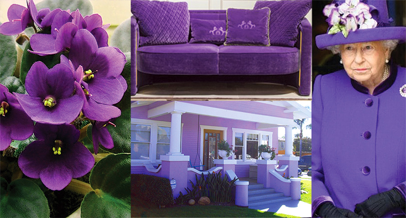
Pantone Color of the Year for 2018:
The Politics of purple
The Pantone Color of the Year for 2018 is Ultra Violet, specifically 18-3838. Pantone says of this year’s pick, “A dramatically provocative and thoughtful purple shade, 18-3838 Ultra Violet communicates originality, ingenuity, and visionary thinking that points us toward the future.”
It goes on, “Nuanced and full of emotion, the depth of PANTONE 18-3838 Ultra Violet symbolizes experimentation and non-conformity, spurring individuals to imagine their unique mark on the world, and push boundaries through creative outlets.”
Another person at Pantone (and by her comment you can tell she not only voted hard for Ultra Violet but is maybe also into recreational herbs, mood rings, and charting her chakras) said “Pantone Ultra Violet takes our awareness and potential to a higher level. From exploring new technologies, and the greater galaxy to artistic expression and spiritual reflection—intuitive Ultra Violet lights the way to what is yet to come.” Good grief, People of Pantone, can’t you just say, “We heart lavender”?
As for the actual choice of color, I feel that after this past year, maybe Pantone was looking for a shade to soothe the soul and calm the crazy, maybe even attempting to cross the aisle color-wise. Something.…blend-y.
I mean I don’t think even the all-powerful Pantone would dare make the Color of 2018 any sort of red. Meddling Russians and Republicans are red. Gerrymandered states, Trump’s X-long taped-together ties and the caps of a dwindling number of his supporters are red. We’re anti-red, America. And the zenith of our not-red was and is an absolute sea-to-shining sea of bright pink pussy hats.
But blue? Well, sure, we’re blue but frankly it’s currently more a widespread state of depression and daily panic—not a color that we’re able to effectively rally behind. Yet. We’re trying. We’re working on that rally in hometown elections and massive marches. We’re speaking up, stepping up, signing up. Pushing those tables together rather than building walls. Political-election-wise the closest we’re getting to truly going blue is Doug Jones in Alabama—not exactly a mandate, but one step closer. Though Pantone does describe this year’s color as “blue-based”. Thank you, Pantone. Another step closer.
I will say some real shade of blue better be the Color choice for 2019 big time, but this year maybe Pantone understands we just need to feel that we’re working toward a balance. And as every art school student knows, mix red and blue and you get purple.
Welcome to 2018 and Ultra Violet. Please enjoy these various snippets of Ultra Violet in the wild and let’s all imagine a brighter, bluer future.
–Barbara Combs