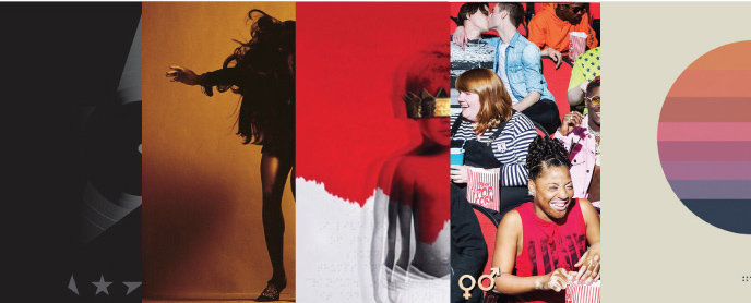
Top 5 album covers of the last few years
I’ve always believed that people who are creative can be inspired by nearly anything. Art inspires art, no matter what kind. As designers, where creativity is the definition of our job, we have to be open to inspiration wherever we can find it. For myself, as well as hundreds and thousands of other designers across the globe, music is one of one of those great influences, whether it’s playing it, writing it, listening to it, or in this case, looking at it.
With vinyl making a resurgence as the preferred way to enjoy an album, the focus in the last five years to perfecting the art of the record cover has once again gained momentum and artists are experimenting with form factor, color, photography and in some cases, hidden imagery for fans to find. Here are my top five picks for the best cover art in the last few years…in no particular order.

1. David Bowie’s Blackstar
Designer: Jonathan Barnbrook
Barnbrook’s cover of Bowie’s last record is deceivingly complex. What appears to be a simple diecut of a star with black on black printing of stars cut into many pieces, is actually so much more. Barnbrook’s design, when exposed to light, reveals an image of the galaxy. The stars at the bottom of the cover actually spell out Bowie. When exposed to blacklight, the stars turn bright blue. When reflecting light off of the record onto a different surface, all three sides of the record display different images. The cover displays a star, one side is a bird in flight and the other is a spaceship. Barnbrook has also hinted during many interviews that fans have yet to find multiple additional gems that are hidden within the walls of the album. This art, to me, is the perfect farewell and tribute to one of the greatest artists of all time, Starman. It’s aesthetically simple and classic with its use of black on black, a fitting memorial for Bowie, but has all of the pizazz and depth of character that he possessed. With light being a featured component to revealing the full extent of the art, it’s as though Bowie’s starlight hasn’t gone out and he still remains present in the folds of the record.

2. The Last Shadow Puppets’ Everything You’ve Come to Expect
Designer: Matthew Cooper
Super group, The Last Shadow Puppets have only released two records in the last 8 years. Their first has a distinctly 60s feel to it both musically and visually, while their sophomore record, released in 2016, seems to have aged at the same pace, with an edgier 70s vibe. The cover photo is of Tina Turner taken in 1969 by then Vogue photographer Jack Robinson, but the color is all Matthew Cooper. His mastery of warm tones adds movement and heat that make the record undeniably modern while maintaining its roots and inspiration from the 70s. It’s a great example of how simple, iconic photography with an explosive color palette can have just as much of an impact as a record with a more unique design attribute.

3. Rihanna’s ANTI
Designer: Roy Nachum
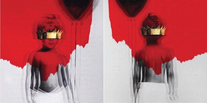
ANTI’s album cover couldn’t be more ripe with metaphor and meaning. The color palette is stark and ominous featuring a splash of red paint and a haunting black and white photo of a young Robyn Fenty (Rihanna), holding a balloon with a gold crown covering her eyes. As Rihanna skyrocketed to fame at a young age, one can interpret this as the blinders she wears from her success and perhaps her inability to grow into her crown. This theme of being blind is reverberated through a braille poem featured on the cover. The poem is a collaboration between Rihanna, artist Nachum and poet Chloe Mitchell. It touches on the idea of being misunderstood but refusing to conform to society’s norms. When asked why Rihanna chose to feature the poem in braille, her response was, “sometimes those with sight are the blindest”. Wiser words have ne’er been spoke.

4. Lil Yachty’s Teenage Emotion
Designer: Mihailo Andic
Teenage Emotion wins the most needed album art of 2017. In his own words, “I wanted to have all these aspects of teenage life…so I thought about all the things I saw in high school for the first time, that I had never experienced before. I have never seen two guys kissing until high school. I’ve never seen albino kids until high school, I’ve never seen emo kids until high school.” But unlike album covers from years past who have used people’s physical differences to shock and appall fans, this glimpse of high school life is unabashedly normal. It’s as though Lil Yachty plunked himself in the middle of a field trip to the movie theater. And there he is, grinning from ear to ear at the humanity that surrounds him. Although some have criticized him for appropriating different cultures and groups of people for his own benefit, Yachty took to Instagram Live to further explain himself, “If you have vitiligo or if you’re gay or whatever it is, embrace yourself. Love yourself. Be happy, positive.” Preach, Lil Yachty. Preach.

5. Tycho – Awake
Designer: Scott Hansen AKA ISO50 AKA Tycho
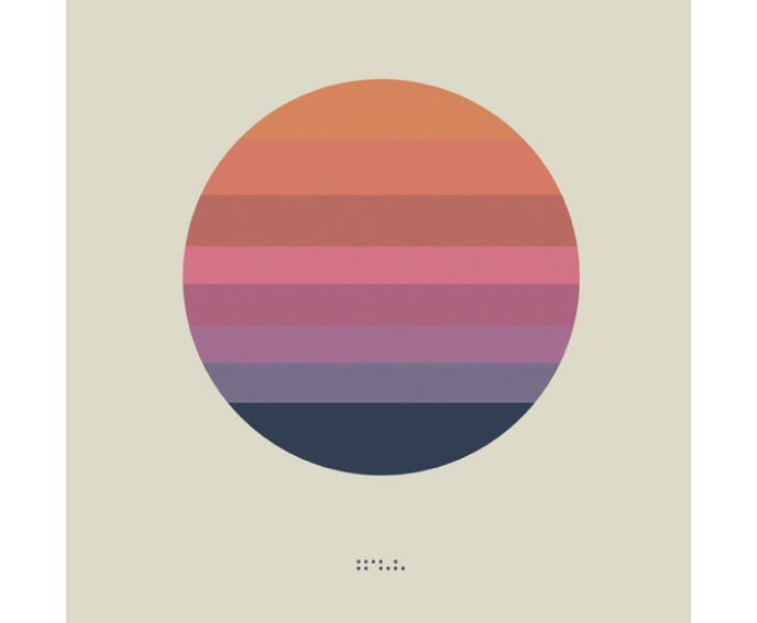
As I mentioned above, it seems like a common occurrence for designers to also be musicians and vice/versa. This case is a perfect example of a designer turned musician turned designer. Scott Hansen’s designs, under the pseudonym ISO50, are bright, modern, full of color and unique compositions. One could argue the same of Scott Hansen’s music. Although Hansen designs all of his Tycho album covers, Awake is a particularly effective merging of the two mediums. Hansen says of this piece that he wanted something that could be used in several different settings and still be recognizable. The tour announcement uses the same colors in the same succession but in a polygon instead of a circle. In some executions, the colors are in a triangular shape or a different shape within a shape. You will notice one key factor though. The colors are always in the same order. Why? Because each color band represents a track on the record. And they truly do represent each of these colors. The record flows from warm to cool but still feels like a cohesive singular unit.
-Eliza
